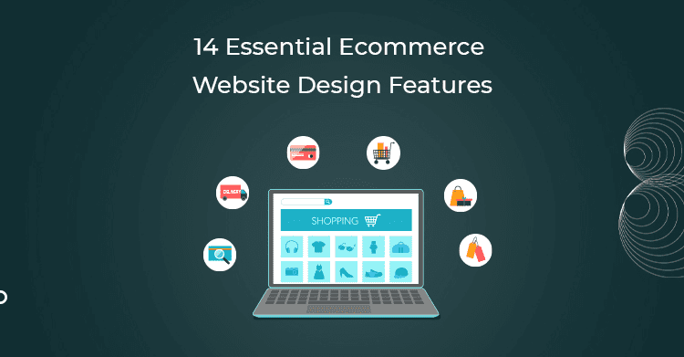
An ecommerce project needs to be given the right requirements by a development agency. If you need such a website, various items could go into its inventory, and some of them will have more content than others. So we suggest creating a list of important features that can help get you started with whatever you may want in your store.
While it’s true that first impressions matter, customers won’t spend much time at all on your website if it’s too difficult to navigate, one thing we have found to be effective is creating a website that inspires your visitors to spend time with you and learn more about the products you provide or just read your blog posts on their way through their day. It takes only a split second for someone to determine whether they like the look of a site or not and leave – so it’s best to make sure people want to stay and keep coming back for more!
Keeping eCommerce shoppers on your website isn’t easy because there are a lot of shops to peruse through. One way to ensure that this doesn’t happen to you is by utilizing an excellent website features list. This will provide detailed features of your store and give its audience a clear idea of what they can expect from it without browsing through or studying every page.
Website Navigation
Navigation is the most important part of the user interface. If a customer cannot get around your website or online store easily and find what they’re looking for, it directly impacts your profits as a company. This is because frustrated customers will quickly go to another site that is easier to navigate.
Feature #1 – Breadcrumbs
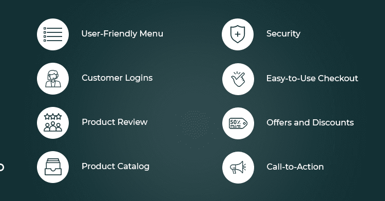
No-no, it’s not about crumbled bread sprinkled with pepper. In ecommerce website development, a “breadcrumb” is an attribute of superior website navigation. Breadcrumbs usually appear on stores whose product pages have deep content hierarchies like categories that span multiple pages. Breadcrumbs are links that indicate to site visitors where they are within the hierarchy separated by the symbol (>).
Breadcrumbs are great visual aids. They tell your users where they are in your store or on the web. That helps them find their way to other products or pages on your site. It also makes it much easier for Google and the other search engines to work out the structure of your website and make sure people can find what they’re looking for.
Bad navigation makes it hard for users to find what they’re looking for. To keep potential customers on your site, you need good navigation. Good navigation helps users find the products and information that they want. It also makes it easier for them to complete an order because it presents a path from the landing page to checkout with the help of menus instead of text links, advanced search functions, custom call-to-action buttons, and more.
Feature #2 – A User-Friendly Menu
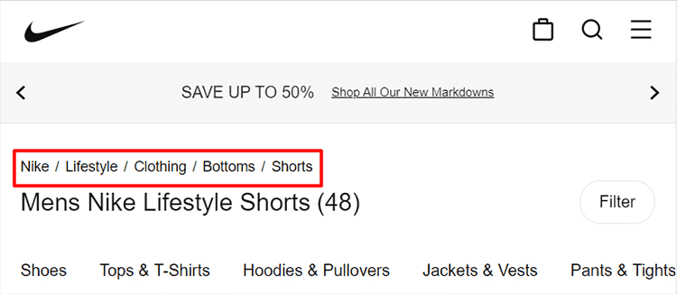
Menus are a crucial part of an ecommerce website’s design, and usually, user-friendly menus that appear across the top or on the left of a site are expected. Menus can also appear as drop-down options when clicking through them vertically. Our customers prefer one of three different menu types on Magento websites: Mega, Dynamic, and Drop-Down menus.
A mega menu is an expandable and collapsible menu that simplifies website navigation with a two-dimensional interface. It combines text, links, and graphic elements to display user options seamlessly.
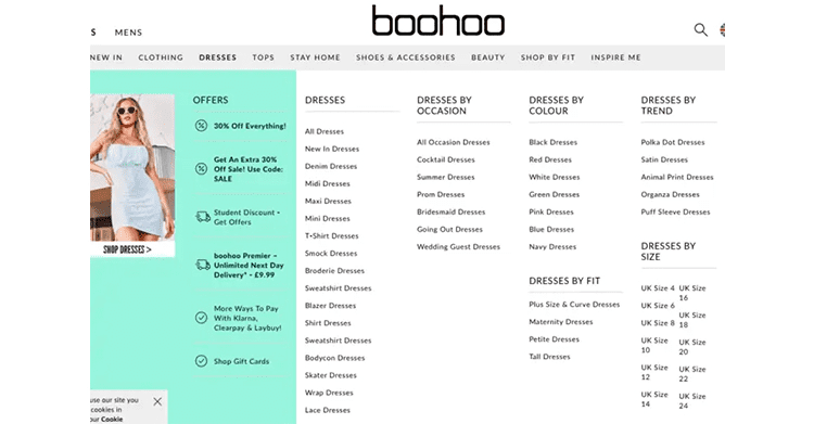
An accordion menu is a quick and simple solution to use while listing products in an online shop, letting you showcase different product attributes and guide the potential client towards purchases.
Feature #3 – Customer Logins
The only way your customers can access features like those above is if they have a way to log in to your company website. Allowing customers to create accounts gives you the information you need on the backend to make personalized recommendations in the future and allows customers to come back and see their existing wishlists, which is a great feature considering how many sites do not have this at all.

Feature #4 – Advanced Search Function & Filtering
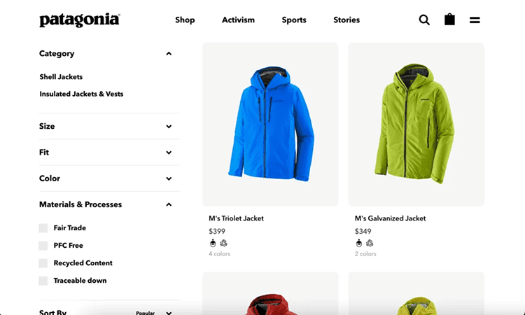
Product search and filtering are top ecommerce website design features as they enable shoppers to focus on the products they’re looking for. Even as customers scroll through catalogs, product filters allow them to create a true wishlist and keep only the products they want to see while skipping over all the products they aren’t interested in.
Feature #5 – Customized Call-to-Action
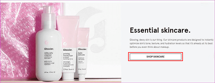
A call-to-action (CTA) button is a great way to encourage customers to take action on your website. Placing CTA buttons strategically throughout your site will move your customers through the sales process and help increase conversion rates. Several types of CTA buttons can be used appropriately on your site, but it’s important to remember that you want each button to match the page’s design and feel. For example, this “Shop Now” button is easily recognizable as an option for visitors and is enticing due to its placement right next to an image of the product featured in a piece of jewelry.
Products
No one likes rummaging through the clutter to find what they need. That’s why product categories are often listed with a product image or featured as an enlarged image at the top of each section in a catalog. You can also make your products easier to browse via a product search tool that filters results by brand, price, and category.
Feature #6 – High-Quality Photos
Ecommerce websites should display high-quality, eye-catching photos optimized for page load. Just think, when you are shopping, would you purchase a product that looks poor? You may be selling the top quality products in your ecommerce store, but if the photos of your products look bad, people are unlikely to buy them.

Use high-resolution photos to grab your clients’ attention! For example, product managers can make a homepage picture more of a focal point by using it as an inspiration to highlight specific products or services on sale.
Feature #7 – Product Catalog
Producing an informative product catalog is important to the success of most ecommerce sites. This document lists detailed information about the items you have to sell, including quality images and descriptions, delivery options, price, order fulfillment charges, etc. Your catalog is organized greatly to how buyers make their final purchase decision. To optimize conversion rates, organizing products into categories relevant to your niche or brand image can be particularly important. For instance, it might be clothes or shoes; for consumer electronics – laptops or mobile devices. Of course, product categories will depend on a business’s purpose.
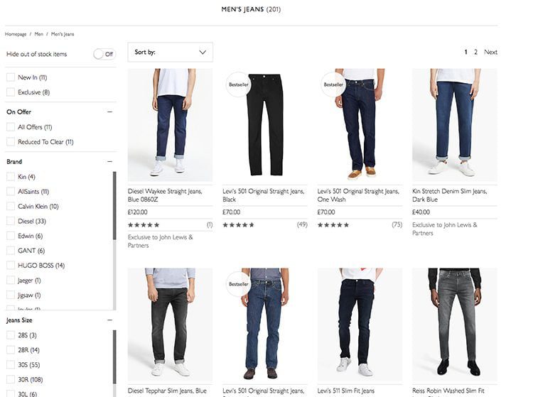
Structuring your categories so that they are diverse and come off as being structured helps customers understand what your website offers. Moreover, it makes it easier for them to find the products they’re interested in shopping for on your web pages.
Feature #8 – Product Page
An informative and appealing item page is the most obvious feature in an ecommerce website. Additionally, it provides added value for customers as it allows them to reflect on whether or not they wish to purchase a product.
Here are some tips for a product page design:
- Include sections for featured products, best-sellers, exclusive items, related products, or top savers. These will encourage customers to buy or explore more.
- Show customers bundles that have been made of most frequently bought products and recommend them more specifically.
- Your customers need to be engaged with the product page’s content, so come up with different techniques to engage them: custom popups and micro-animations, customer testimonials, and product recommendations.
Use micro-interactions to make your ecommerce website sing! They can improve the overall user experience (UX) of a website and highlight specific areas that you want customers to pay attention to. Micro-interactions typically involve scrolling visuals, transition animations, sound effects, or error messages.
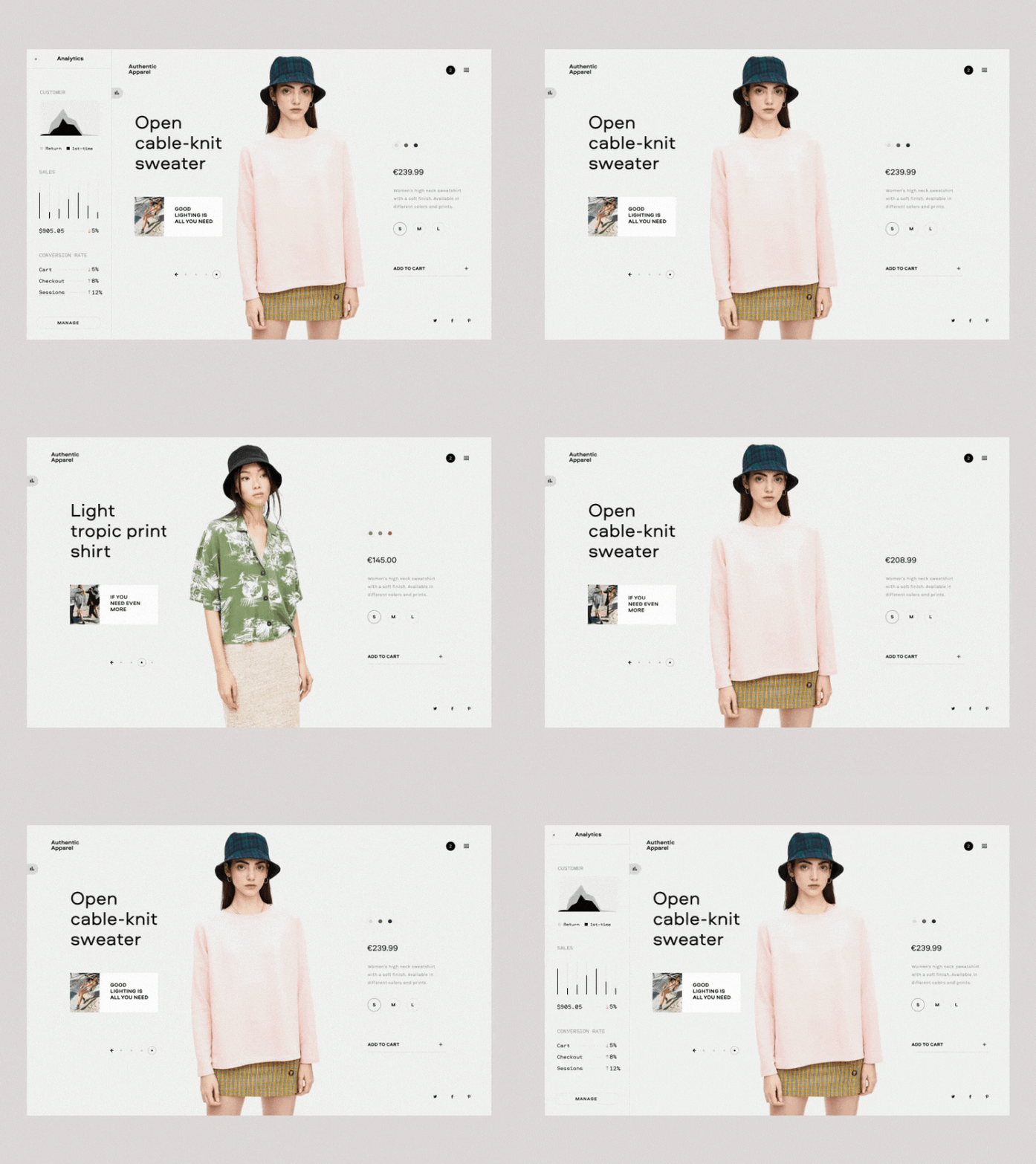
This animation takes place once a customer has added your product to their shopping cart. It’s engaging and fun, providing useful feedback to indicate that the purchase has been successfully placed in the customer’s shopping cart.
Marketing
Marketing is all about strategy and features. One way you can strengthen your marketing campaigns is by using special offers, gift cards, and other price-reduced items in your ecommerce site’s store.
Feature #9 – Product Reviews
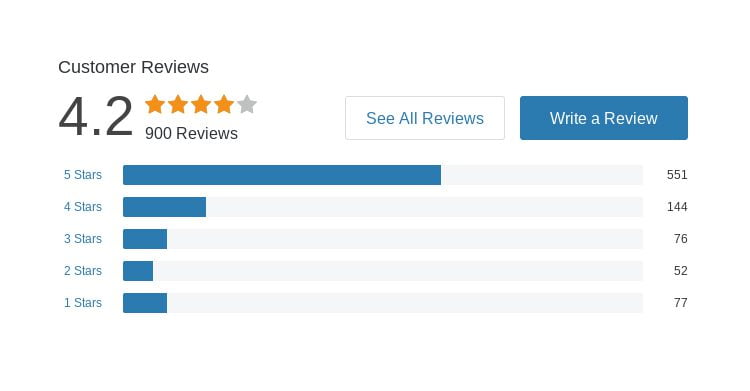
Reviews are like buttons that people can press and “push.” They are usually displayed on the home page or real estate of various products and are important for social proof as they serve as a testimonial for your ecommerce website. For example, if your customers love your product or trust you as a brand, visual testimonials from satisfied customers make it easy for someone to click “add to cart” without hesitation because they see others have done so with confidence. In addition, real customer reviews push up customer loyalty, which is important because when customers purchase from you again, repeat business is like money in the bank!
Feature #10 – Special Offers & Discounts
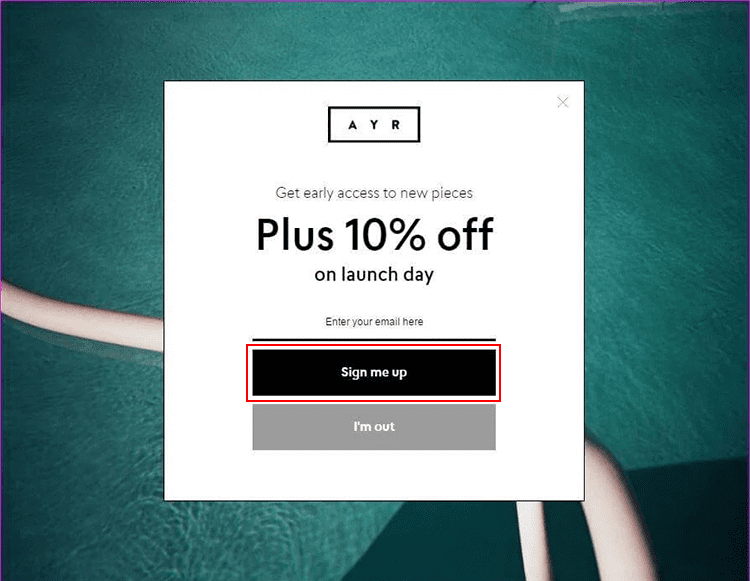
It would be best if you didn’t think that discounts, offers, and freebies offered directly on the product page are a bad thing. It is one of the best ecommerce website features out there! This is because your customers will purchase more. After all, they think they are saving more. Limited-time promotions or “Buy One, Get Two Free” offers, for example, present customers with an all-or-nothing scenario. It creates a sense of urgency about needing to complete the purchase before losing out on these special promotional deals instead of saving them for later. The idea behind dropdown offers that pop up when certain actions are made (i.e., typing in your email address) is to capture leads by hard and fast conversions, rather than relying on their return visits – which can be notoriously unreliable!
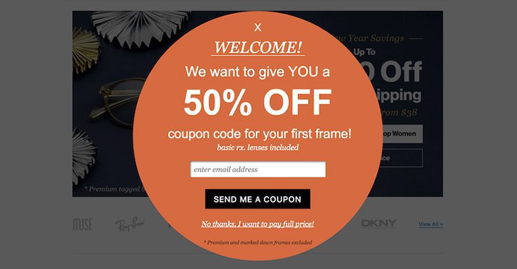
What’s better than paying money? Not having to pay at all! People are likely to complete an order and purchase if shipping is free or discounted; thus, reducing a customer’s shipping fees increases sales.
Feature #11 – A Well-Designed Shopping Cart
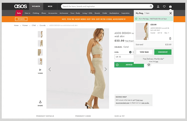
A shopping cart is the #1 requirement for most e-commerce sites. This is where your customers can keep their items to continue the checkout process further. A shopping cart should be simple and have basic functionality such as allowing the customer to change quantities, discount rates, etc. In addition, it should display company branding (colors, logo, motto) and have prominent checkout buttons where applicable. A shopping cart can also be a place where you engage directly with your customers by making promotional offers accessible through the cart itself.
Feature #12 – An Easy-to-Use Checkout
The average online shopping cart abandonment rate is 69.89%. This can be devastating to any business, especially if you have a well-established e-commerce presence and have gained many loyal customers only to see them leave at the very last moment because they felt inconvenienced by the checkout process that was put in place. The best way to keep your profit margins high and reduce your e-commerce cart abandonment rate is to optimize various aspects of the purchasing flow to be consistent with your brand image while also being transparent and easy for potential consumers to use when checking out.
Tip#1 Make your customers fill out only the information required to complete a purchase. This includes details like mailing and billing address, credit card number, and shipping option. Whatever else you provide is frivolous and will only annoy your customers! They might abandon your site in frustration or shop with you then decide not to return because the extra hassles involved with purchasing from you were too much to handle.
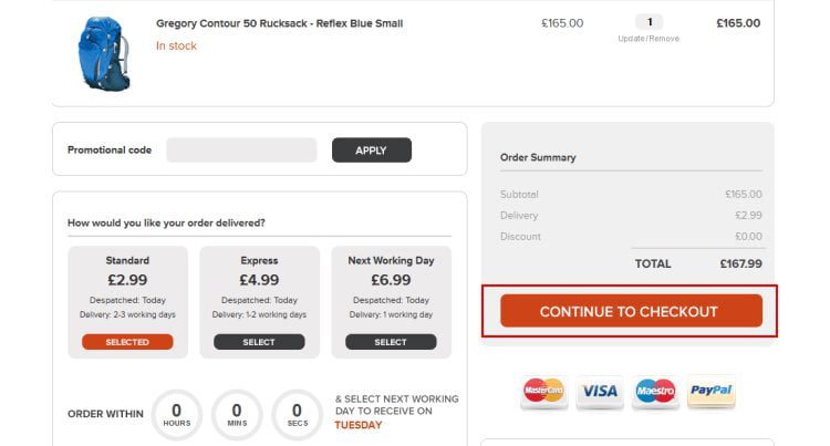
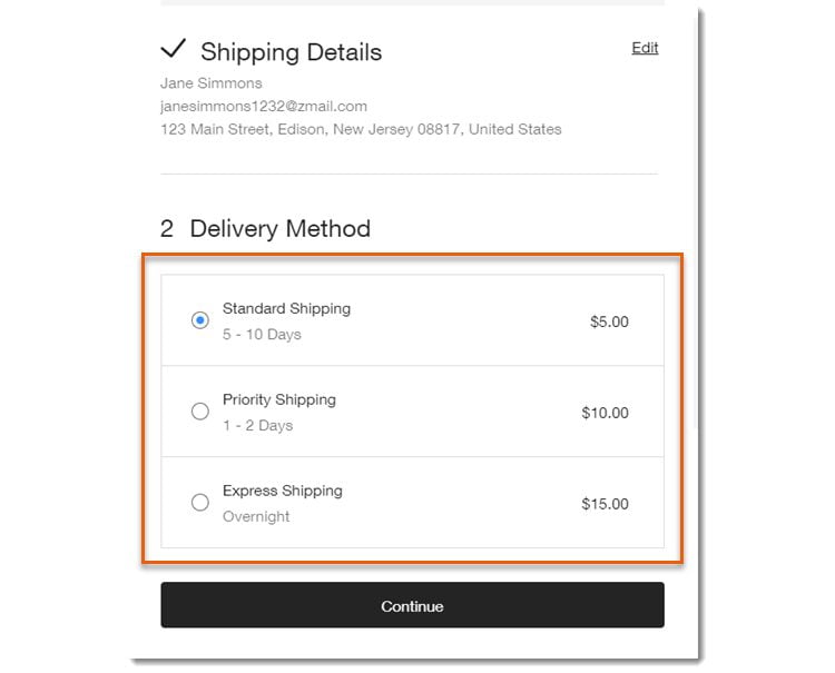
Feature #13 – Multiple Shipping Options
Shipping is one of the must-have features that every ecommerce store needs to compete with other ecommerce stores successfully. Of course, you might need to integrate some software application that will support your shipping needs, but make sure it’s important that a customer can place an order and receive their items on time! Additionally, your customers should be able to choose multiple delivery options for their orders. Finally, the system should automatically calculate the shipping costs and include details about the time it takes for a customer’s item to arrive.
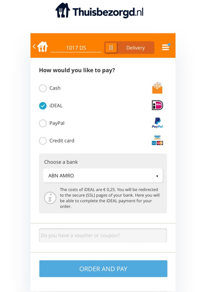
Feature #14 – Secure Payment Options
Similar to shipping, there must be payment options your customers can use. A credible ecommerce store has various payment gateways such as Paypal, Stripe, and Google Pay. Furthermore, there should be a way for the customer to select from a list of different options to cover their needs depending on where they live, e.g., PayPal for more European countries and China. In contrast, Stripe might be more popular in the US-Japan or middle east. Make sure you choose the payment gateway according to your customer’s location to get the most business possible and don’t leave money on the table! Adding ApplePay and Google Pay to your checkout would also help customers order from their mobile devices as payments made using these methods have doubled since 2016 – so it may also help boost e-commerce profits through mobile sales, so don’t take this one; of the shortlist!
Conclusion
The above mentioned are not the only features that could be part of your ecommerce website design, depending on your business budget and target audience. Remember: whatever solution you decide to implement regarding your online store’s design, it is paramount that it be simple, easy-to-use, and accessible for everyone. In addition, what’s more, vital is that it provides value in some manner – a variety of informative product descriptions or a one-stop shopping experience. As a result, you will only begin to see more people convert into loyal customers and interest – into sales. Finally, when you’re ready to commit to setting up your store, make sure you select a reputable ecommerce website design agency that has extensive experience and knows how your business works so they can come up with an ideal solution based on your specific needs.
If you’d like help getting your ecommerce website up and running or taking your ecommerce business to the next level, or want website care plans, consider us. Request a free quote online or call us to get started.

